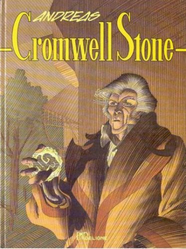
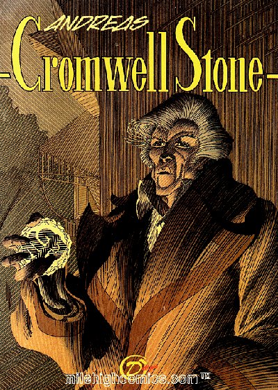
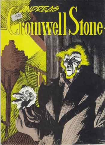
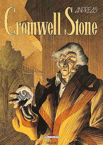
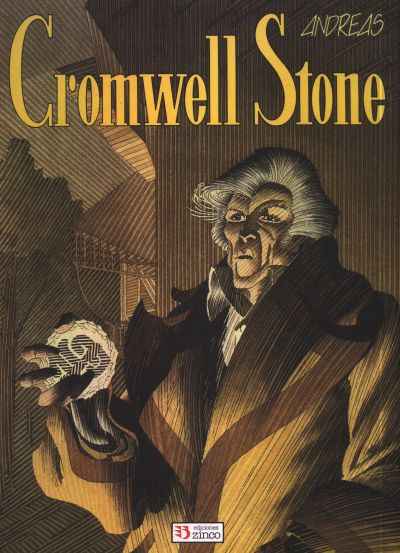
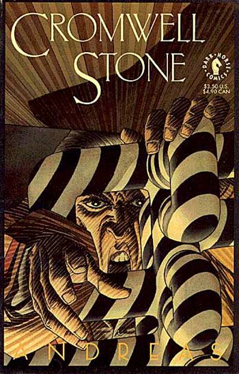
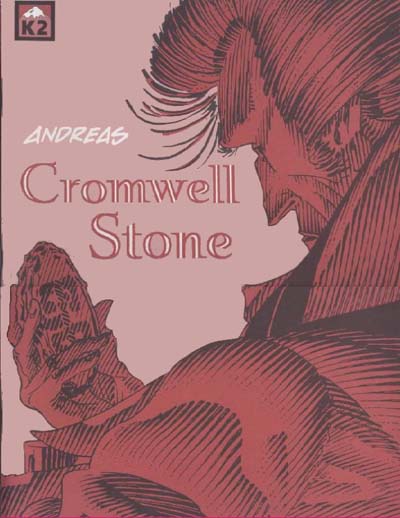
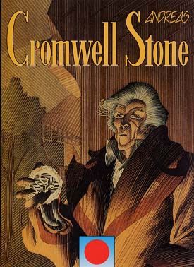
Leaving the story for what it is, as not to give away to many details, I can delve briefly into
the drawing. It's hard not to be impressed by the care with which Andreas thinks of every detail of
his world and works it out in his drawings. But if this story, that was prepublished in 1982 and 1983
in Le Journal Illustré (le plus grande du monde) is published in A4 format in black-and-white as well, the weaknesses in Andreas'
approach become clear: Andreas always wants to put every detail of his inventively created worlds
on paper. To put it simple, he completely fills all his pictures; in the case of Cromwell Stone one
can even say its crammed, because Andreas not only draws every object, but also the materials out of which they
are created, and the shadows they cast on eachother.
The drawings of Cromwell Stone are masterpieces of technique each on their own, but fail in the point of view
of 'readability'. The story demands an edition in color (by means of color the elements of a drawing
can be separated, important details can be put up front, minor details can go to the background) and
on a larger format than A4. But anyone who has seen Le Lombard's edition of Passages knows
what (some) publishers are capable of. If the album is translated at all.

