In this book we encounter, only three pages away from eachother, two of the nicest examples of Andreas’ page layouts.

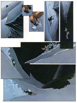
Page 17. Rork slides from a snowy slope and falls into a ravine. We see that the panels are positioned, and that the drawings in the panels are oriented, in such a manner, that the eye
follows the fall without leaving the page.
Comic art uses in general a "superimposed" storytelling: Reading the cases of the first strip, detaching the eye from the first strip, seeking and connecting with the second strip of panels, at the end detaching again from the page, seeking and connecting with the third strip, and so on... like the needle of a sowing machine.
In this page, the eye "follows" the movement. By doing so, the artist creates a cinematographic effect by forcing the eye of the reader to actually follow the movement of the character. Additionally, the absence of detaching-seeking-connecting results in a more "fluent" reading. (peut-être un moins grand risque de briser l'illusion référentielle, si ce n'était déjà fait en exposant tant de plaisir à dessiner et découper) [translator: hard to comprehend the meaning of the original sentence].
I once talked about it to Andreas, who very modestly said "The Americans do it all the time". Here I think that Andreas is wrong. The mainstream comics, as I believe that those are the ones he was referring to, often guide the eye of the reader, but the most common effect is a simple diagonal allowing us to understand very fast, like publicity in printed media often oriented from top left to bottom right, the strategic direction.
To summarize, let’s say that it’s a way to reproduce our western way of reading. With Andreas, this system is more "Global" and never limited to one specific direction easing the reading of the page.
Indeed, everybody who has just skimmed trough an album of Andreas will not have understood it. You only understand Andreas by reading, as a large part of the work has been left to do by the reader.
We can compare two, almost similar at first sight (guiding the eye), page layout effects while their application (diagonal versus winding movement) and envisioned effect (improved readability versus immersion in the story) is completely opposite.
We can read more about the cinematographic effect in
"Les Bijoux Ravis", from Benoît Peeters, where Hergé demonstrates this in the fall of Nestor from the stairs (pg 11 - The Castafiore Emerald)

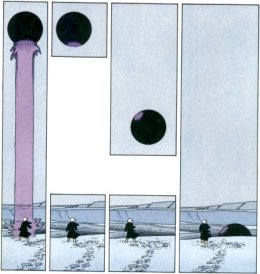
Lets take page 15 of the same album. Rork observes a globe that descends into a gullet. Andreas opposes the globe and Rork versus each other in two strips of two panels. The first panel containing the globe that descends, the second panel, Rork who observes it.
Both strips are framed left and right by a panel of the same height as the two individual panels. In order to "decode" the system, the reader has to understand by this "framing" that the two panels (although one placed above the other, and thus in comic language one happening
before the other) are in fact happening
simultaneously.
Another, maybe even stronger example, can be found in
"Lumière d'Etoile", fourth album of Rork, page 32. The man and the cat have a telepathic link, and the superimposed panels makes us understand this even before Shamah discovers it.
Throughout these examples (but there are plenty with Andreas), we start to understand that comic art does not have to be limited to "sequential" (linear) art. Comics can function also in a cinematographic or juxtaposed way. The page layout itself participates in the storytelling.
Stéphane Deschamps
Translation: Carl Wyckaert
This article appeared in the summer of 1998 on the website Bédéphiles.
Carl Wyckaert adds:
More about this can be found in "Understanding Comics" 1993 Tundra Press, Scott McCloud.
http://en.wikipedia.org/wiki/Understanding_Comics